KANAME -
CBD cosmetics
︎︎︎ Client:
private investor
︎︎︎ Scope:
strategy, naming, branding,
, packaging, stationery
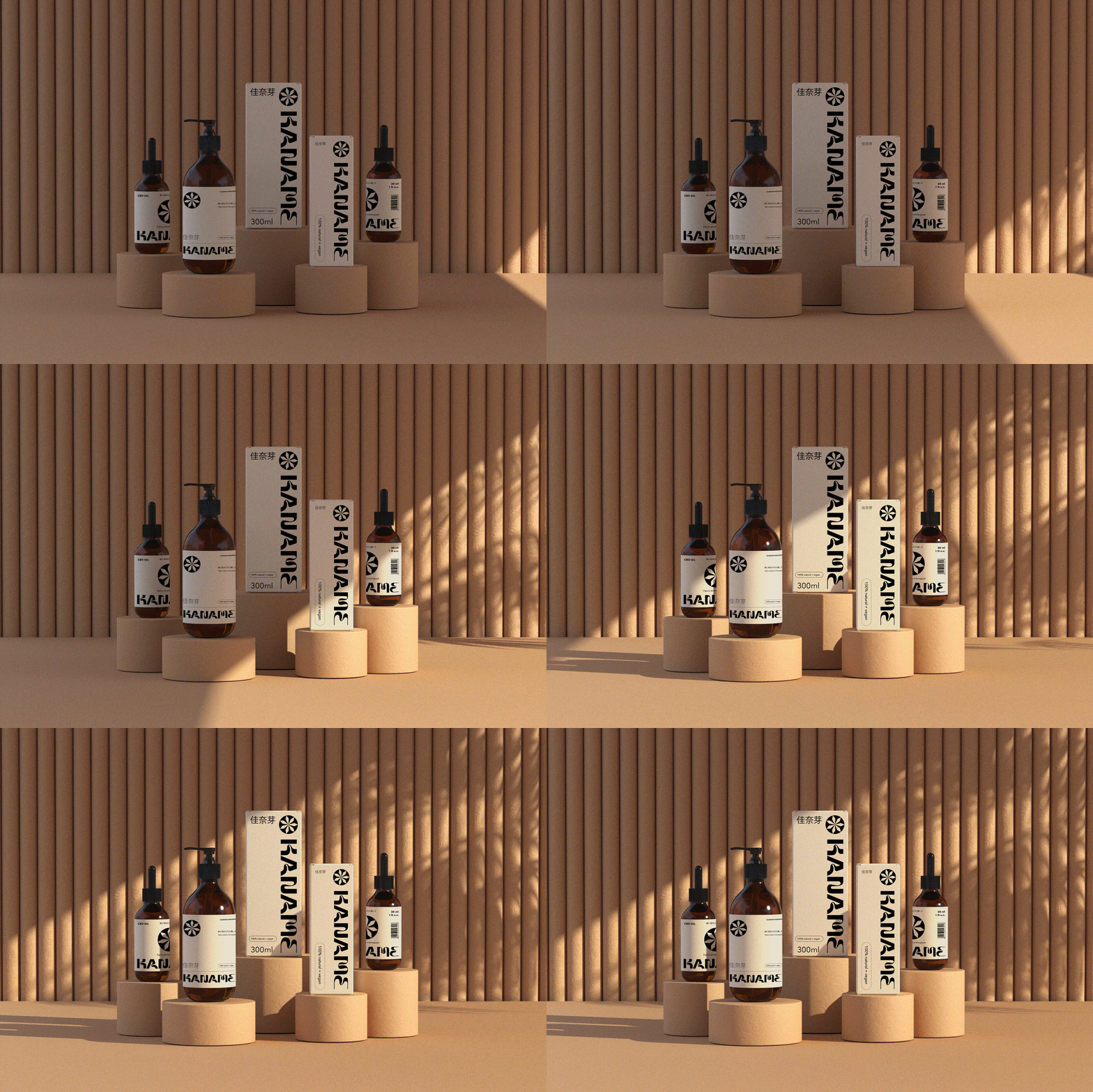
Kaname - a vegan and natural cosmetics company that specializes in cannabis-based skincare, challenged us to create a unique brand identity that would stand out in the market without relying on the stereotypical "cannabis" imagery. Our goal was to create a minimalistic yet modern design that would appeal to the target audience.
Inspired by the owner's love for Japanese culture and design, we developed a brand name with sonic connotations to "cannabis" and translated it to "young buds" in Japanese. This reflected the brand's fresh and unique approach to cannabis-based skincare. To further incorporate Japanese aesthetics, we utilized simple yet elegant design elements and a clean color palette that complemented the product line.
By staying true to the brand's values and vision, we were able to create a unique and memorable brand identity that stands out from the competition. The resulting design is both modern and attractive, while maintaining a minimalist approach that reflects the essence of the brand.


